
Corporate Rebrand
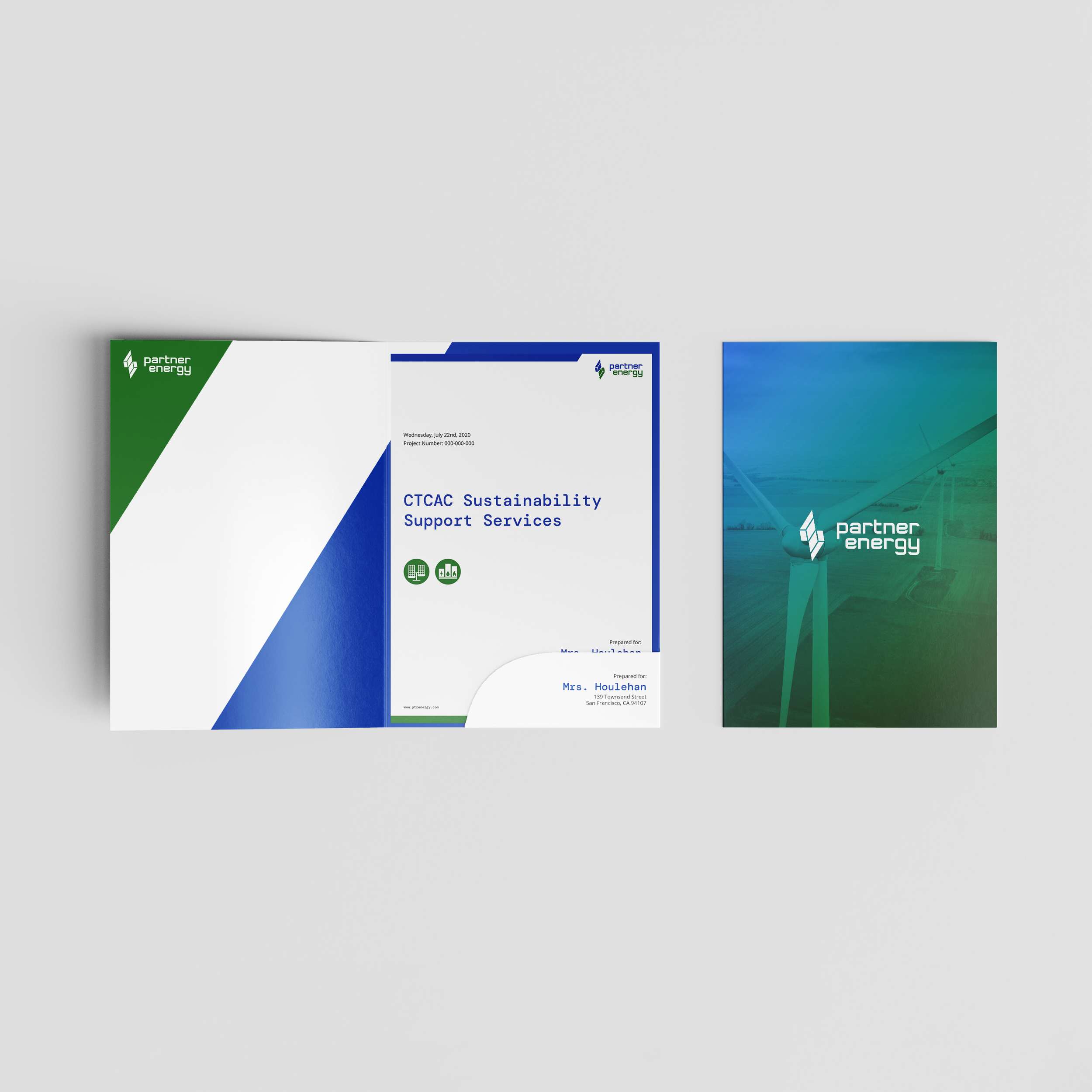
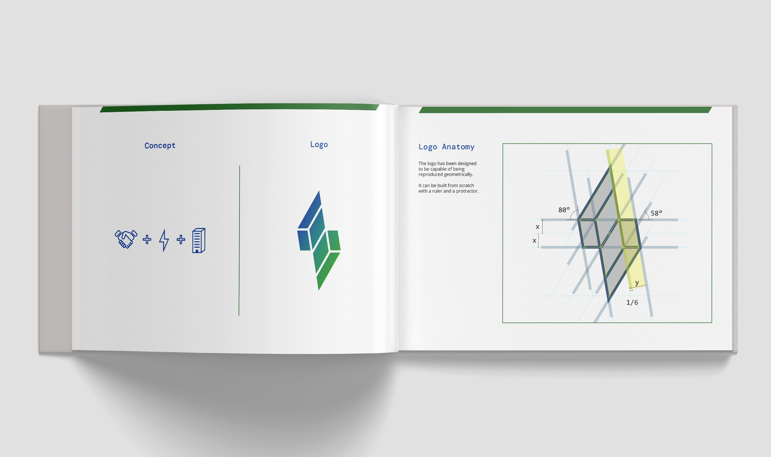
Hojoon was brought on by Partner Energy to give a fresh new look to their aging company, which was perceived as too corporate and lacking in creativity. The company's aesthetic was seen as uninspired, with a design reminiscent of basic templates. Hojoon was able to breathe new life into the company's image by creating a new logo and developing graphic standards that helped to make the company go from bland to distictive.
Skills & Deliverables
Brand Guidelines
Logo
Brand Collaterals
PowerPoint Templates
Document Templates
Custom Iconography

New Logo


Brand Guidelines

Brand Collateral


Custom Iconography


